What in the World ? Map Bias Towards the Global North
What in the World? The History of Maps and Bias Towards the Global North
Did you know that the African Continent is 14 times larger than Greenland? Or that, whilst the entire country of Brazil and the U.S. state Alaska look roughly the same size, Brazil is five times larger? Now, I could wait whilst you pull out your scratch-off travel map or pull out your phone to look at Google Maps, or I could tell you a bit about the history of these maps and how inherent northern bias has distorted our perceptions of the world.
I know, I know, you are rolling your eyes at the prospect of a history lesson about maps, but trust me, this is something you’re going to want to keep reading. The maps we recognise and use today are thought to have originated in the Medieval times, however these first maps were not geographically accurate. Instead, space was thought of as a series of places, with distance measured not in length but instead time taken to complete the journey between places. Take a look at the picture below: this map produced in the 12th Century shows the route from London to Jerusalem. Instead of the traditional image of crossing Europe, passing through Turkey, and then down the Arabian Peninsula, important destinations on the route are depicted largest, with no regard for what lies in between. The people who used these maps did not particularly care for the geographical accuracy of their maps, but instead they just wanted to know how to get from A to B and how long it would take to do so.

Via The British Library
By the middle of the 16th Century, maps had become more like what we know today, with the Ptolemy world map being the first recorded use of latitude and longitudinal lines and the depiction of distance as a measurement, not just in time. The Ptolemy map depicted the land masses of the known world, with the visible outline of Europe, Northern Africa, the Arabian Peninsula, and Asia across to India. During this time, maps were becoming increasingly accessible and standardised across Europe, developing a collective European understanding of the world. In parallel with the European mapping revolution, maps of similar age have also been found in many other regions, including China, Japan, Mesopotamia (modern day Iraq, Kuwait, Turkey and Syria) and in the Arabian Peninsula. Many of these maps did not conform to the European interpretation of space, and instead were used for specific purposes, such as land allotment or property ownership. However, as with much of Colonial History, the arrival and domination of Europeans forced these countries to conform to the western perception of the world.

Via The British Library
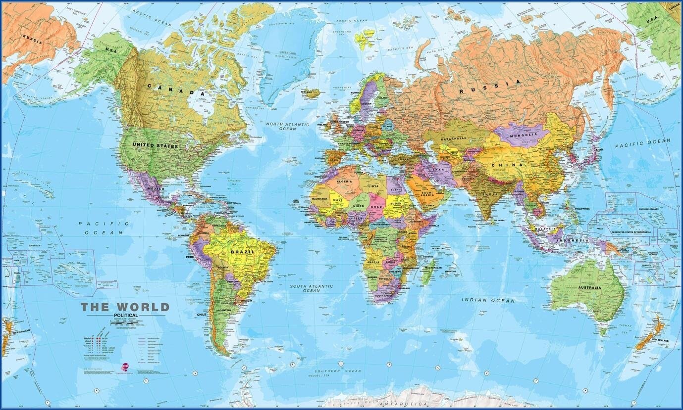
Today, the most common map in use is the Mercator Projection, created by cartographer Geradus Mercator in 1569. This type of map became popular for sea navigation due to its representation of the Earth divided into equal grid squares. However, unless you are in support of the Flat Earth movement, you will agree that the Earth is not a 2D object. In fact, the Earth is considered an irregularly shaped ellipsoid (don’t worry, I had to Google it too), and therefore, it cannot be easily divided into nice, equal squares. This causes the countries at the top and bottom of the map to be enlarged whilst countries along the equator appear smaller. This has created a collective distortion of our world perception.

Have you ever considered why Europe or the U.S. are placed at the centre of the map? Or why the map is orientated northwards when we are just an irregularly shaped ellipsoid zooming around in space? In pre-Biblical and Biblical times, maps traditionally placed east at the top of maps, as you had to turn that way to face Jerusalem. Alternatively, and quite logically, Egyptians placed south at the top, as they believed the northward flowing Nile must flow “down” due to gravity. North orientation came about with the use of latitude and longitudinal lines in Ptolemy’s world map; however, it is not entirely known why this decision was made. Whatever the reason, today we continue to place north at the top which subsequently drives the perception of northern dominance, as southern countries are beneath us- both figuratively and literally.
South-up maps work to challenge our idea of northern dominance, placing developing countries in the global south on top and combatting the size bias that occurs in the Mercator projection. The inflation of country size in the global north (think the US, Russia, Canada and Europe) works to inflate their global dominance, whilst countries along the equator are projected smaller than their actual size. Thus, on the global stage they are likely to be treated as small, less important countries due to the perception of them being as such.
If all this map talk has made you confused about what our blue planet actually looks like, the AuthaGraph world map pictured below is considered the most accurate 2D representation of the world. It was created by Japanese architect Hajime Narukawa and ensures Africa and other equator countries are no longer shrunken, whilst the true vastness of the Pacific Ocean is represented. Whilst it is not completely accurate (again, think irregularly shaped ellipsoid = difficult to make 2D), it challenges our traditional understanding of our world and how it's laid out, which is pretty cool in itself.

Via Authagraph
If you want to know more about maps, The Cartography of State by Jordan Branch is an excellent read. If you would like to know more about AuthaGraph and how it is created, you can watch this TED talk by Hajime Narukawa himself.
{Editor’s Note}: Fans of The West Wing will also recognize this discussion of the inaccuracy of classical maps from Season 2, Episode 16. Like C.J., you too might be thinking “What the hell is that?” after seeing what the world really looks like. But in the words of the wise Dr. John Fallow, “It’s where you’ve been living this whole time.” Spread the word.
Ellen Stirling is an International Relations masters student at the University of Glasgow with a BSc degree in Meteorology and Climate Science from the University of Leeds. She is currently working on her masters thesis, which explores how gender inequality was compounded by the 2010 Haitian earthquake.